Display font for Japanese-style headlines, signage, and themed branding
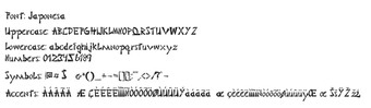
Japonesa, by Japonesa, is a stylized display font that emulates traditional Japanese calligraphy for decorative headings and branding purposes. It converts Latin letters into brush-like forms intended for posters, signage, and themed graphics, giving a cultural visual cue in layouts. The design emphasizes high-contrast strokes and calligraphic rhythm suited to headline roles. Graphic designers and content creators who need a themed display face will find it straightforward to deploy.
What does Japonesa change about desktop typography?
Japonesa applies a brush-informed construction to Latin letterforms, shifting ordinary headings toward a clearly decorative, culturally themed voice. The font targets assets that need immediate visual identity, for example:
Posters and event flyers
Restaurant menus and signage
Martial arts and cultural branding
As a display face it prioritizes expressive shapes over extended readability, so it is best for isolated titles and identity elements rather than running text.
How much typographic control does it give designers?
The file exposes a single, stylized glyph set rather than a family of weights or variable axes, so designers adjust scale, spacing, and color but not internal stroke weight. It supports standard Latin alphanumerics (A–Z, 0–9) and uses high-contrast, ink-like strokes to suggest calligraphy. It does not include native Japanese scripts, so multilingual typesetting requires additional typefaces for authentic text.
Is Japonesa easy to install and use across desktop apps?
The font ships as a TrueType file and integrates with any desktop program that reads system fonts. On Windows, installation is a right-click “Install” or dragging the .ttf into C:\Windows\Fonts; after that the face appears in font menus inside word processors and design applications. Standard workflows such as applying layer styles, kerning adjustments, and rasterizing text layers operate as they do with other TTF fonts.
Does Japonesa work across systems and where does it circulate?
Japonesa is compatible with desktop operating systems that accept TTF files, including Windows, macOS, and Linux. Distribution occurs through common font platforms and independent repositories, and community feedback notes frequent use for niche, themed projects. Designers commonly pair the face with a neutral body type to preserve legibility while keeping the headline visually prominent.
Who should choose Japonesa?
Japonesa is a focused choice for designers who need an immediate, decorative headline voice with a cultural motif. Apply it selectively to primary titles and promotional assets, and increase letter spacing or tracking when layouts are tight to aid clarity. This face suits projects that require a strong themed identity rather than extended reading, making it appropriate for branding and event graphics that rely on distinctive title treatments.
Pros
Brush-stroke letterforms mimic Japanese calligraphy for decorative headlines
Supports standard Latin A–Z and 0–9 for immediate use
Distributed as TrueType for wide desktop application compatibility
Strong visual impact in headings, logos, and signage
Cons
No native Japanese scripts (Hiragana, Katakana, Kanji) included
Single stylized weight limits flexibility for body text
Decorative strokes reduce legibility at small sizes
Laws concerning the use of this software vary from country to country. We do not encourage or condone the use of this program if it is in violation of these laws. Softonic may receive a referral fee if you click or buy any of the products featured here.